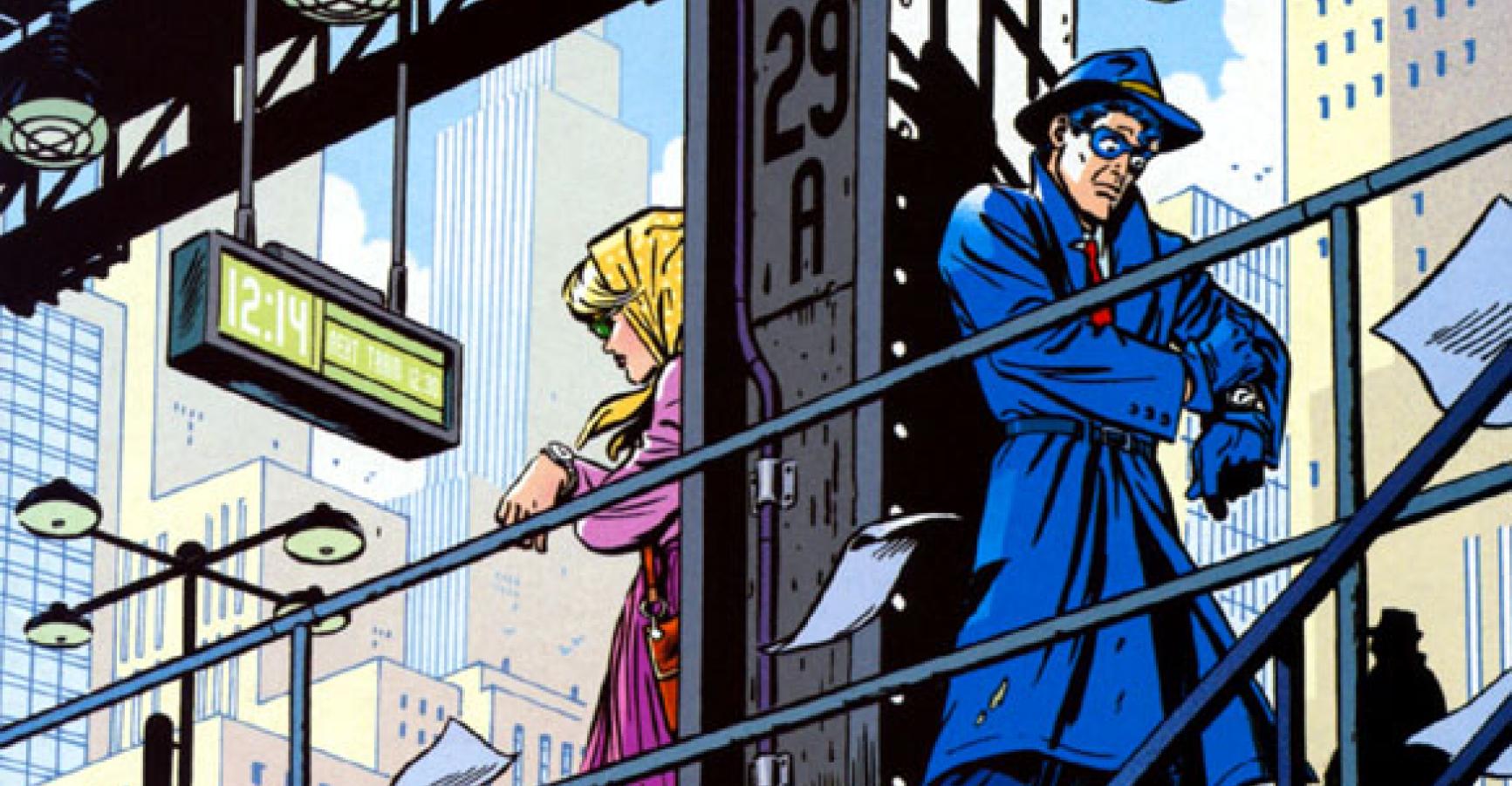
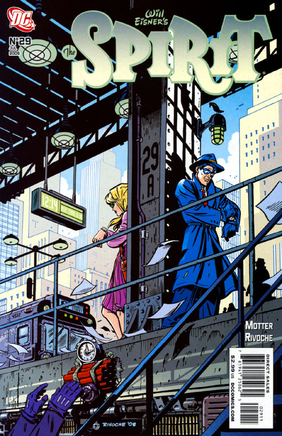
 This is, hands down, the best cover I’ve seen on a comic for a while, maybe all year: DC’s THE SPIRIT #29 drawn by Paul Rivoche. It’s a master class in everything a cover should be, and I’m going to be using it as an example of “how to do it right” for perhaps the rest of my life. Let’s walk through it:
1) It’s more than just a single image; it tells a story. Your eye goes right to the Spirit first, then to the girl, then the fact that each of them is looking at his/her wristwatch and their body language makes it clear that they’re waiting for one another. And THEN your eye drifts down to see the bomb being placed. And THEN you see the time on the bomb. AND THEN your eye wanders back up to the digital clock overhead and notes that the explosion’s one minute away. God, this cover is BEGGING you to open up the book to find out what happens next.
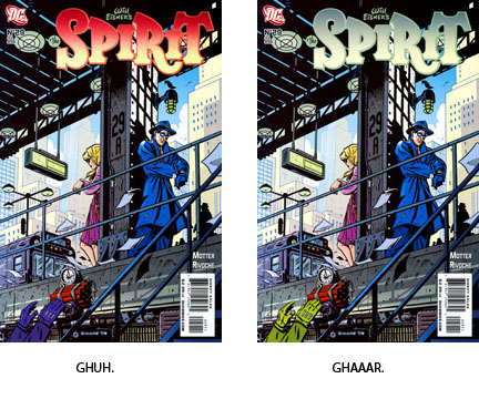
2) It is colored perfectly. PER-FECT-LY. The eye immediately goes to the Spirit, the central character of the book, in his bold, primary blue. Then the eye naturally drifts/drops to the left to see the woman in her bright but secondary colors. Then down to the bright red of the bomb. And the villain’s sleeves are colored spectacularly–standing out just exactly enough to be visible and not get lost in the gray of the subway platform, but not garish enough to pop before you see the bomb or pull focus away from it. The two most important elements of the illustration–the hero and the bomb–are the elements that stand out clearest, as it should be. And the logo color is dead-bang spot-on–it picks up from the other colors on the illustration and yet still stands out as legible. If someone had made that that logo, say, bright red to punch it up, I’d have had to hurt them. It would have thrown off the balance of the whole piece. Similarly, had the villain’s arms been bright enough to scream for attention, they would have fought to be seen first and would have ruined the pacing of the composition.
3) The drawing itself is designed with the precision grace of space shuttle. Everything points towards the two main figures. Everything. The blown papers. The villain’s arms. The train. The slats above. The digital clock, for Heaven’s sake. THE LAMP OVER SPIRIT’S HEAD. And yet, none of those elements are obtrusive or call too much attention to themselves.
I have, like all right-minded people, long been a fan of Paul’s work, but this is just a harmonic home run. Young illustrators, young editors, when in doubt, do this. This is a cover. I’m going to be using it as a teaching prop from here on out.
*Amended to add: Yes, I’m well aware that the arms in the lower left belong to The Octopus, who is often (though not always) in purple, but I was making a larger point about color composition which still stands–there are a bunch of ways to jazz up those arms to such a degree where they’d still be insanely distracting even if you stayed within the purple-tone family.
