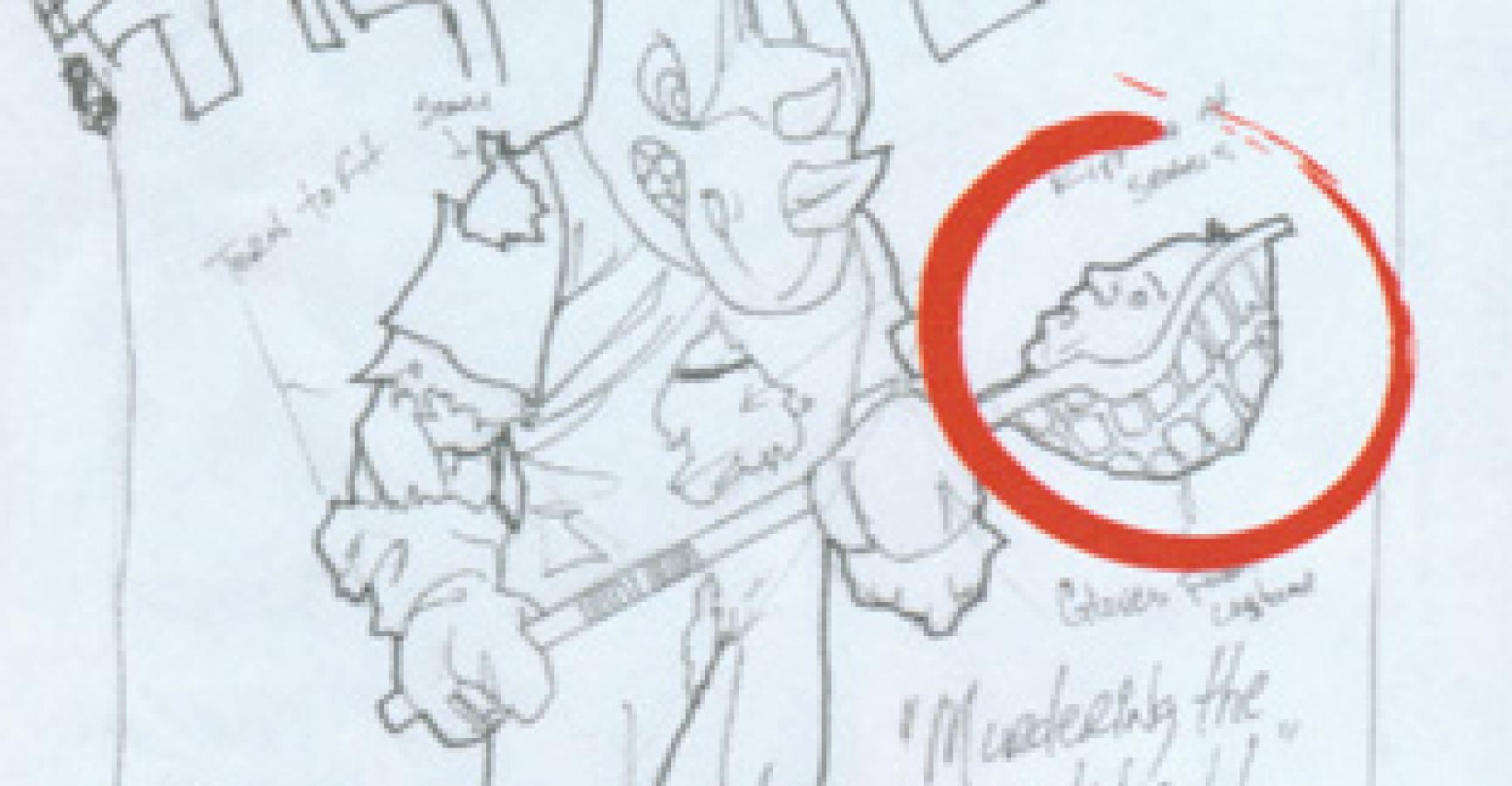
Artist, please draw more attention to the severed head.”
Probably my favorite part of the editorial job–not co-plotting with writers, not copyediting scripts, not having the interns Google me all day–is working out covers. Part of that is because I’m a particularly visually minded editor, but mostly it’s because I still believe the cover is a key sales tool and sets the readers’ expectations for what’s actually inside the book in a way that nothing else can.
There was a time when the cover’s job was more important than it is today–back when all comics were basically an inexpensive impulse purchase from newsstands and from spinner racks, before fans began pre-ordering their comic books months in advance. Yes, most shops have new comics shelved so you can see the entire cover at once, which is a step up from newsstand displays that, at best, showed only the top third, but that doesn’t make cover art three times as important as it was–in the 21st century, most buyers have already committed to buying the newest issue of AVENGERS (or whatever) before they even walk into the store, regardless of what’s on the cover.
(And if you’ve ever wondered why so many modern covers are pin-up shots of characters rather than story-oriented illustrations, the answer’s generally twofold: pin-ups can be stockpiled in advance, and they can be repurposed for t-shirts and other merchandise at far less a cost than original material.)
That said–and feel free to call me Mr. Old-School–I still believe the cover’s primary job is to catch and hold the reader’s eye on the off-chance someone might actually be on the fence about picking it up. The cover’s not there to be a showcase for the artist, not to be lush or ornate just to show off, but to catch and hold attention amidst a sea of Wolverine comics.
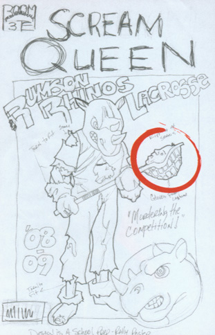
The cover’s secondary job is to, with its frozen-moment single illustration, convey an idea. Extra points if the image makes me laugh out loud (like Nate Watson’s, shown above, even before I asked him to make the severed head bigger to help underscore the balance of comedy and horror of SCREAM QUEEN, about a serial killer who stalks a high school while dressed as its mascot).
When I commission a cover, I first ask for a couple of sketches–not because I feel the need to suggest a million “improvements,” but because I don’t want an artist to waste his time on anything that’s too close to a piece we’ve already done or that’s already in the works. Clever ideas outrank pin-ups, at least for me. A composition that tells me that the artist has a sense of design and isn’t just doodling kewl art onto the paper is critical. And (again, pointing to Nate Watson’s sketch here) the cover has to capture the feel of the series for new readers. Once the sketch has been approved, the artist turns it into a finished piece, remembering at all times (because I am a tyrant about them) my essential rules:
1. I REALLY, REALLY, REALLY HATE ILLUSTRATIONS THAT OBSCURE THE LOGO (a.k.a. the title of the magazine). You can get away with that more easily if, like Superman’s or Playboy’s, your logo is already instantly recognizable to a mass audience. “Cthulhu Tales” is not that logo. (A great logo is in and of itself a thing of beauty. And like most works of art, I can’t produce one myself but I know a good one when I see it. One of the all-time best logo designers is the multiple-award-winning letterer Todd Klein (Sandman, Swamp Thing), who regularly runs in-depth studies on what makes logo designs work or not work. I implore you to go visit his site to read the analysis of someone exponentially more qualified than I am to explain the do’s and don’ts.
2. LOGOS SHOULD BE IN ONE SINGLE COLOR THAT’S COMPLEMENTARY TO THE COLOR OF THE MAIN ILLUSRATION. Sub-rule: Any drop-shadow behind the logo, conversely, should be in a contrasting color. That would seem to be common sense, but you’d be aghast at how often it’s ignored.
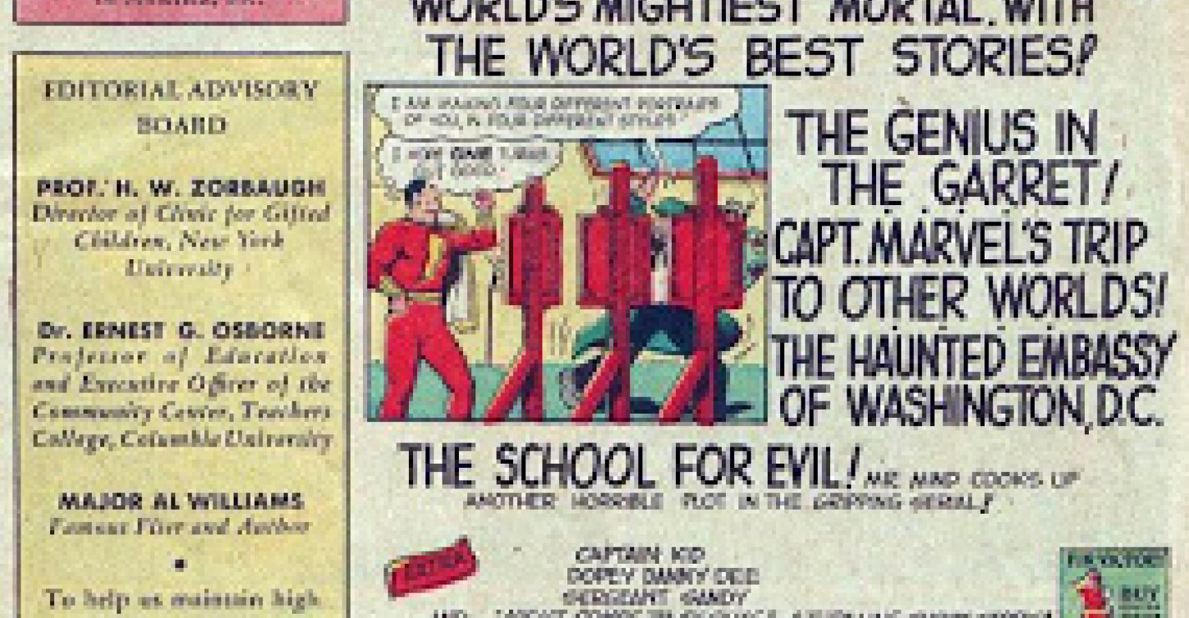
3. LEAVE ROOM NOT ONLY FOR THE LOGO BUT FOR THE “TRADE DRESS,” a.k.a. the company insignia, the issue number and month, and (God help us all) that dreaded barcode that began destroying American magazine covers before you were born and that I dream every day to someday see banished–but which, for now, remains a necessary, stinking, zebra-striped evil and I’m off-topic, aren’t I? Sorry. It’s just that, to this day, I still remember the very first comic I ever bought that had a barcode on it–Daredevil 130–and I’m still traumatized to this day. I thought it was gaudy and distracting back then, and my opinion hasn’t changed in the intervening 33 (!) years. I’d love to see barcodes banished, but in an understandable but still vomitous victory of commerce over art, most comics distributors insist that they be on the front cover or else they won’t handle your book. The advantage it gives them in computer inventory-management overrules the fact that it’s a nauseating blight. If you’re a big enough publisher, you can sneak a back-cover UPC every great once in a while, but since no advertiser is keen on having it interfere with back cover ads they’ve paid for, it’s generally not an option. Onward….
4. FLOP IT. Even if you think a cover sketch is a home run, and especially if you don’t, always turn it over and hold it up to the light so you can see what it looks like in mirror-image. A surprising number of times, it makes the mediocre good and the good better.
5. GIVE ME SOMETHING I CAN SEE FROM ACROSS THE ROOM. Bold colors. And/or white space. And/or stark illustrations. Simple is always, always better.