Straight up, I will tell you that with the craptacularly unproductive week I have just had, I don’t feel qualified today to give anyone advice on how to count to ten, much less how to do comics. Still, I will soldier on, however briefly.
The old school of thought was that having an eye-catching, dynamic cover was the single most important factor in comics production, because (duh) that’s the first thing an impulse buyer sees. I still think there’s lots of truth to that, but since our audience is now made up predominantly of hardcore, informed buyers who have already largely decided sight-unseen what they’re gonna buy on Wednesdays, it’s no longer a truism. Still a good rule of thumb (and a future blogpost), but not as critical as it was back in the day when your great-great grandfather and I used to buy comics for a nickel down at the trolley stop.
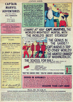
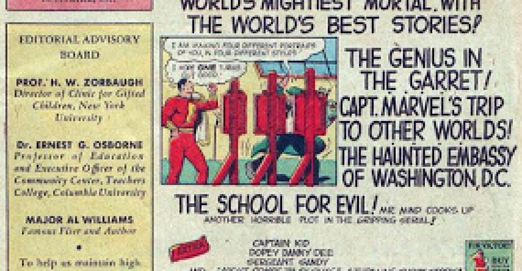
The second most important graphic element of a comic, I was taught, was Page One. This theory was likewise predicated on the impulse-buyer idea, that purchasers who were lured by the cover but were still on the fence could be sold with a strong initial page–a “splash page” (to use industry jargon) that was a single, bold image, almost a second cover. This is a guideline that I think outlived its usefulness as a hard-and-fast rule a long time back. In fact, I’m not totally sure it was ever really true. For one thing, I never met anyone who, if they needed additional selling past the cover, wouldn’t just flip through the whole book. And for another thing, one of the very best-selling comics series of all time was Captain Marvel Adventures, and here’s what for the entire decade of the 1940s you’d see every month on page one:
Or, to put it in contemporary terms, the most acclaimed comic of all time, Watchmen, starts every issue on a nine-panel grid. So my advice is, don’t let anyone tell you that your first page has to be a splash page.
HOWEVER.
Your first page, like the first paragraph of a prose story or the first image on a movie screen, must be arresting. It doesn’t absolutely have to be a full-page shot–but if it’s not, it does absolutely have to make you want to turn the page to find out what happens next (or learn how you got to this interesting place). Really, truly, I can’t say this strongly enough: if there’s not something remarkable happening on that first page, something we’ve never seen before, then rethink it. Be honest with yourself: nothing on Earth is gonna want to make you wanna read past page one if page one is a sequence of a guy going to work in the morning. I don’t care that the sequence might be integral to your story, I don’t care that it’s drawn nicely, I don’t care that it sets up his situation. If we don’t get to the end of the page and find out that the place he works makes suits out of human skin, there is nothing there to make you not wonder why you just spent four bucks on this. I’m overstating for emphasis–I’m not really saying your only option is to be shocking, and Chris Ware, for one, whose genius eclipses my meager talent like the moon eclipses my driveway, gets by just fine by drawing us in slowly and without sensationalism–but I’m serious when I say you cannot underestimate the patience of a potential reader, not with only about 22 pages to spend on your story.
Comics are not film. Don’t think you have to begin with an establishing shot of the city, then slowly pan in on the deli where your main character works. Just start your damn story, and the faster you can get to the unfamiliar, the better.
Personally, I like the page one splash, particularly if it could serve as a second cover. I’m not adamant about it–there are plenty of comics I’ve written that start with slow, dramatic builds and sort of explode around page two or three–but there’s something really satisfying to me about being able to grab you on page one. By way of example, here–thanks to artist Ron Garney, who nailed what I described perfectly, as he always does–is, of the eighty majillion page ones I’ve written, my hands-down favorite one ever, from Captain America #4, 1998:
